This season will mark the Baltimore Ravens' 30th in the NFL, and though many aspects of the franchise have changed over the years, their look has remained relatively consistent.
The Ravens had a different primary logo in their earliest days, but after a copyright dispute with the original designer, moved to the logo fans know and love today in 1999. Since then, their primary purple and white uniforms, as well as the black alternate introduced later, have remained almost entirely identical. They have gotten more experimental at times, such as in 2015 with the awful gold pants and last year with the "Purple Rising" alternate uniforms, but their primary look has been the same.
While Ravens fans love the team's look, national pundits seem a bit more divided. USA TODAY's Nate Davis ranked the Ravens' uniforms at No. 25 in the league, though that is an improvement over the No. 28 ranking they received last year.
"I’ve long contended they look like bruises – which is somehow apropos given the tough guy football identity this franchise has almost always had. And when you’re mainly adorned in black and purple, that’s going to happen," Davis wrote. "The Maryland flag baked into the shoulder crest remains the best detail. And give them credit for trying the 'Purple Rising' look last season, which featured a forward-facing bird on the helmet. But meh."
Listen, trying to argue about uniforms is the pretty silly in the grand scheme of things. We're literally debating whether or not the color of clothes look right, so if Davis isn't fond of the Ravens' look, then more power to him.
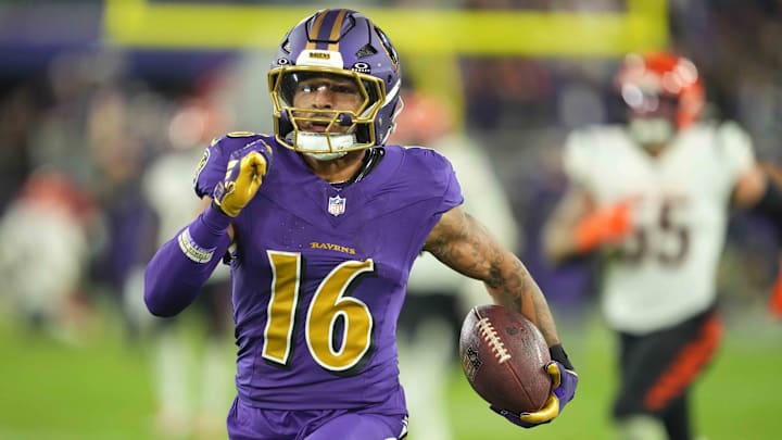
For our money, however, the Ravens have a pretty solid wardrobe all things considered. They're one of just two teams in the NFL to use purple as their primary color, the Minnesota Vikings of course being the other, and they pull off the look well. Additionally, it's hard to top the intimidation factor when they break out the all-black uniforms during prime time in front of a raucous crowd.
")
-1750218575-q80.webp "The '1,000-yard receivers in the 2024-25 NFL season' quiz")
-1753637027-q80.webp "Giants Quarterback May Be Traded in Surprise Move")
